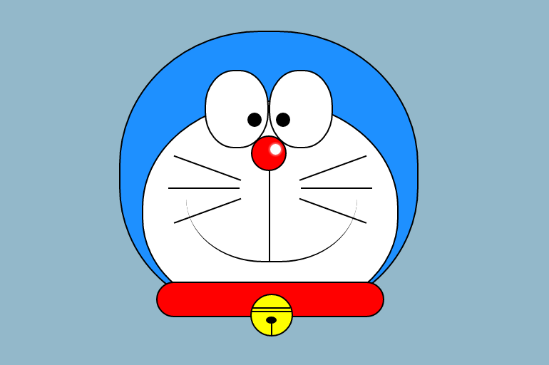
CSSのみで描いたドラえもんの作り方です。
DEMO
HTML
<div class="face_01"> <div class="face_02"> <div class="eye_box clearfix"> <div class="big_eye_left"> <span class="small_eye_left"></span> </div> <div class="big_eye_right"> <span class="small_eye_right"></span> </div> </div> <div class="nose_01"> <span class="nose_01_shadow"></span> </div> <div class="nose_02"></div> <div class="mouth"></div> <div class="whisker_left"> <span class="whisker"></span> <span class="whisker"></span> <span class="whisker"></span> </div> <div class="whisker_right"> <span class="whisker"></span> <span class="whisker"></span> <span class="whisker"></span> </div> </div> <div class="collar"> <div class="bell_01"> <span class="bell_02"></span> <span class="bell_03"></span> <span class="bell_04"></span> <span class="bell_05"></span> </div> </div> </div>親要素である顔の青い部分の輪郭.face_01の中に2つの子要素である、白い部分の輪郭.face_02と首輪の.collarが存在しています。
白い部分の輪郭である.face_02の中には、更に目の.eye_box、鼻の.nose_01(光が当たっている部分),.nose_02、口の.mouth、ヒゲの.whiskerがあります。
首輪の.collarの中に更に鈴の.collarがあります。
CSS
* { box-sizing: border-box; } body { background: #93B8CA; } .clearfix { content: ""; display: block; clear: both; } .face_01 { margin: 50px auto; position: relative; width: 420px; height: 400px; background-color: #1E90FF; border: 2px solid #000; border-radius: 47% 47% 45% 45%; } .face_02 { position: absolute; bottom: 0; left: 30px; width: 360px; height: 300px; background-color: #FFF; border: 2px solid #000; border-radius: 50% 50% 45% 45%; } .eye_box { position: absolute; top: -45px; right: 90px; width: 180px; height: auto; } .big_eye_left, .big_eye_right { width: 90px; height: 110px; background-color: #FFF; border: 2px solid #000; border-radius: 46%; } .big_eye_left { float: left; } .big_eye_right { float: right; } .small_eye_left, .small_eye_right { position: absolute; top: 60px; width: 20px; height: 20px; background-color: #000; border-radius: 50%; } .small_eye_left { left: 60px; } .small_eye_right { right: 60px; } .nose_01 { position: absolute; top: 47px; left: 151px; width: 50px; height: 50px; background-color: #FF0000; border: 2px solid #000; border-radius: 50%; } .nose_01_shadow { position: absolute; top: 10px; left: 25px; width: 15px; height: 15px; background-color: #FFF; border-radius: 50%; box-shadow: 0px 0px 2px 2px rgba(255, 255, 255, .4); } .nose_02 { height: 130px; width: 2px; position: absolute; top: 95px; left: 176px; border-left: 2px solid #000; } .mouth { position: absolute; top: 25px; left: 60px; height: 200px; width: 240px; border-bottom: 2px solid #000; border-radius: 0 0 45% 45%; } .whisker_left, .whisker_right { position: absolute; top: 60px; width: 180px; height: 180px; } .whisker_left { left: 0; } .whisker_right { right: 0; } .whisker_left span:nth-child(1), .whisker_right span:nth-child(1) { position: absolute; top: 30px; height: 60px; width: 100px; border-top: 2px solid #000; } .whisker_left span:nth-child(1) { left: 30px; -webkit-transform: rotate(20deg); transform: rotate(20deg); } .whisker_right span:nth-child(1) { right: 30px; -webkit-transform: rotate(-20deg); transform: rotate(-20deg); } .whisker_left span:nth-child(2), .whisker_right span:nth-child(2) { position: absolute; top: 60px; height: 60px; width: 100px; border-top: 2px solid #000; } .whisker_left span:nth-child(2) { left: 35px; } .whisker_right span:nth-child(2) { right: 35px; } .whisker_left span:nth-child(3), .whisker_right span:nth-child(3) { position: absolute; top: 90px; height: 60px; width: 100px; border-top: 2px solid #000; } .whisker_left span:nth-child(3) { left: 50px; -webkit-transform: rotate(-20deg); transform: rotate(-20deg); } .whisker_right span:nth-child(3) { right: 50px; -webkit-transform: rotate(20deg); transform: rotate(20deg); } .collar { position: absolute; top: 350px; left: 50px; width: 320px; height: 50px; background-color: #FF0000; border: 2px solid #000; border-radius: 30px; } .bell_01 { position: absolute; top: 15px; left: 130px; width: 60px; height: 60px; background-color: #FFFF00; border: 2px solid #000; border-radius: 50%; } .bell_02 { position: absolute; top: 17px; left: 1px; width: 53px; height: 18px; border-top: 2px solid #000; } .bell_03 { position: absolute; top: 22px; left: 0; width: 57px; height: 23px; border-top: 2px solid #000; } .bell_04 { position: absolute; top: 30px; left: 20px; width: 15px; height: 10px; background-color: #000; border-radius: 50%; } .bell_05 { position: absolute; top: 37px; left: 27px; width: 30px; height: 20px; border-left: 2px solid #000; }顔の青い部分である.face_01を基準に、後に続く各パーツを絶対配置するため、position:relative;を指定しています。
.eye_boxの中に左目の.white_eye_left(白目),.black_eye_left(黒目)と、右目の.white_eye_right(白目),.black_eye_right(黒目)をfloatで配置しています。
鼻の.nose_01に.nose_01_rayを重ねることで、光が当たっているように見せています。
.Philtrumは人中です。
ヒゲは左右に2つのボックスである.whisker_left,.whisker_rightを作り、その中に左右3本を入れています。
首輪の.collarを基準に、ベルの.bell_01を絶対配置しています。
.bell_02,.bell_03,.bell_04,.bell_05でベルの形状を表現しています。
以上でCSSで描かれたドラえもんを終わります。