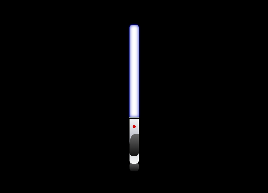
スターウォーズに登場する武器であるライトセーバーの作り方です。
DEMO
赤いボタンを押下すると青いライトが伸び、再び押下すると縮みます。
HTML
<div class="grip"> <div class="light"></div> <div class="guard"></div> <div class="button"> <a href="#"></a> </div> <div class="pattern"></div> <div class="grip_end"></div> </div>握る部分<div class="grip"></div>の中にライト<div class="light"></div>、鍔<div class="guard">、グリップエンド<div class="grip_end"></div>が内包されています。
CSS
body { margin: 0; padding: 0; } .grip { position: absolute; bottom: 20%; left: 50%; margin-top: -75px; margin-left: -15px; width: 30px; height: 150px; background: -webkit-gradient(linear, left top, left bottom, color-stop(0.00, #f6f7f7), color-stop(0.51, #b7b9c5), color-stop(1.00, #f6f7f7)); background: -webkit-linear-gradient(top, #f6f7f7 0%, #b7b9c5 51%, #f6f7f7 100%); background: -moz-linear-gradient(top, #f6f7f7 0%, #b7b9c5 51%, #f6f7f7 100%); background: -o-linear-gradient(top, #f6f7f7 0%, #b7b9c5 51%, #f6f7f7 100%); background: -ms-linear-gradient(top, #f6f7f7 0%, #b7b9c5 51%, #f6f7f7 100%); background: linear-gradient(to bottom, #f6f7f7 0%, #b7b9c5 51%, #f6f7f7 100%); border-radius: 0 0 10px 10px; } .guard { position: absolute; top: 0; left: 0; margin-left: -2px; width: 34px; height: 5px; border-radius: 10px; background: -webkit-gradient(linear, left top, left bottom, color-stop(0.00, #afbdc0), color-stop(0.50, #6d7673), color-stop(0.50, #0a0f0b), color-stop(1.00, #0a0809)); background: -webkit-linear-gradient(top, #afbdc0 0%, #6d7673 50%, #0a0f0b 50%, #0a0809 100%); background: -moz-linear-gradient(top, #afbdc0 0%, #6d7673 50%, #0a0f0b 50%, #0a0809 100%); background: -o-linear-gradient(top, #afbdc0 0%, #6d7673 50%, #0a0f0b 50%, #0a0809 100%); background: -ms-linear-gradient(top, #afbdc0 0%, #6d7673 50%, #0a0f0b 50%, #0a0809 100%); background: linear-gradient(to bottom, #afbdc0 0%, #6d7673 50%, #0a0f0b 50%, #0a0809 100%); } .button a { display: block; position: absolute; top: 25px; left: 10px; width: 10px; height: 10px; background-color: #D20808; border-radius: 50%; } .pattern { position: absolute; bottom: 25px; left: 50%; width: 30px; height: 70px; margin-left: -15px; border-radius: 50% 0 10px 10px; background: -webkit-gradient(linear, left top, left bottom, color-stop(0.00, #666), color-stop(1.00, #111)); background: -webkit-linear-gradient(#666, #111); background: -moz-linear-gradient(#666, #111); background: -o-linear-gradient(#666, #111); background: -ms-linear-gradient(#666, #111); background: linear-gradient(#666, #111); } .grip_end { position: absolute; z-index: -1; bottom: -25px; left: 50%; width: 30px; height: 30px; margin-left: -15px; border-radius: 10px; background: -webkit-gradient(linear, left top, left bottom, color-stop(0.00, #666), color-stop(1.00, #111)); background: -webkit-linear-gradient(#666, #111); background: -moz-linear-gradient(#666, #111); background: -o-linear-gradient(#666, #111); background: -ms-linear-gradient(#666, #111); background: linear-gradient(#666, #111); } .light { position: absolute; top: 0; left: 0; width: 30px; height: 0; border-radius: 10px 10px 2px 2px; box-shadow: 0 0 5px rgba(3, 12, 186, 0.8), 0 0 8px rgba(3, 12, 186, 0.8), 0 0 15px rgba(3, 12, 186, 0.9)inset; }グリップ.gripを基準に各パーツを絶対配置しています。グラデーションはGrad3から抽出しています。このグラデーションがライトとなります。
jQuery
$(function() { var $light = $('.light'), $button = $('.button').find('a'); $button.bind('click', function(event) { event.preventDefault(); $button.toggleClass('on'); if ($button.hasClass('on')) { $light.stop().animate({ height: '300px', top: '-300px' }, 800, 'easeInCirc'); } else { $light.stop().animate({ height: '0', top: '0' }, 800, 'easeInCirc'); }; }); });event.preventDefault();
ボタンをクリックした際のリンク動作を消しています。
button.toggleClass('on');
$buttonをクリックすると、$buttonにonクラスが追加されていればonクラスを削除し、追加されていなければ追加します。つまり、初めは$buttonにonクラスは追加されていないため、ボタンがクリックされるとonクラスは追加されます。
if (button.hasClass('on')) {...}
$buttonに.onが追加されていれば、$lightのheightとtopの値を変更させてライトが伸びるような表現をしています。
$buttonに.onが追加されていなければ、$lightのheightとtopを元に戻すことで、ライトが縮むような表現をしています。
以上で、光る!伸びる!ライトセーバーの作り方を終わります。