作成できるボタン
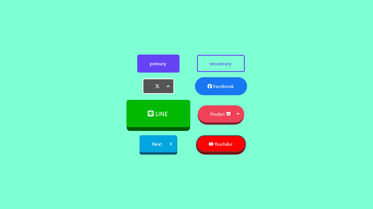
今回実装するボタンのコンポーネントを使うと、以下のようなボタンを作成することができます。

カスタマイズのイメージ
上記のボタンは、コンポーネントの以下の属性を組み合わせて設定することで作成できるようにします。
- variant(バリエーション)
- fontSize(ラベルのサイズ)
- round(丸くする)
- wide(横いっぱいに広げる)
例えば、丸い形のプライマリーボタンにしたければ、以下のようにround属性とvariant属性をそれぞれ以下のように組み合わせて設定します。
<Button
	round={true}
	variant="primary"
></Button>
このようにして、いろんな属性を組み合わせてボタンのカスタマイズを行います。 また上記の属性以外に、typeやhref、disabledなど、要素(button, a)が元々持っている属性も設定可能にします。
コンポーネントの実装
カスタマイズのイメージが掴めたところでコンポーネントの実装を行います。
コンポーネントを定義する
まずは、buttonタグとaタグのボタンを表示するコンポーネントをそれぞれButtonとAnchorButtonという名前で以下のように定義します。
import React, { PropsWithChildren } from 'react';
type CommonProps = {
  variant?:
    | 'primary'
    | 'secondary'
    | {
        background?: string;
        text?: string;
        border?: string;
      };
  round?: true;
  wide?: true;
  fontSize?: string;
};

type ButtonAttr = React.ComponentPropsWithoutRef<'button'>;
type AnchorAttr = React.ComponentPropsWithoutRef<'a'>;

type ButtonProps = CommonProps & ButtonAttr;
type AnchorButtonProps = CommonProps & AnchorAttr;

const Button = (props: PropsWithChildren<ButtonProps>) => {
		<button>{props.children}</button>
};

export const AnchorButton = (props: PropsWithChildren<AnchorButtonProps>) => {
	return <a>{props.children}</a>
};

export default Button;
現時点ではpropsを受け取って要素を返すという最低限の内容ですが、ここに色々と追加していきます。
propsの定義
ButtonとAnchorButtonコンポーネントが引数として受け取るpropsはそれぞれ以下のように定義しています。
| プロパティ | 用途 | 型 |
|---|---|---|
| variant | ボタンの種類を決める | “primary” or “secondary” or { background: string; text: string; border: string; } |
| round | 丸いボタンにする | true |
| wide | ボタンの幅を親要素いっぱいに広げる | true |
| fontSize | ラベルのフォントサイズを決める | string |
| children | ラベルを追加する | React.ReactNode |
| …rest | HTML要素(button,またはa要素)が元々持つ属性を指定する | HTMLButtonElement or HTMLAnchorElement |
※propsは、コンポーネントが受け取るデータを格納するためのオブジェクトです。コンポーネントが受け取るデータとは、コンポーネント使用時に設定された属性のことです。設定された各属性は以下のようにpropsというオブジェクトに変換されたのちコンポーネントへ引数として渡ります。
<Button variant="primary" round={true} /></Button>
// ↓
const props = {
	variant: "primary",
	round: true
}
// ↓
const Button = (props) => {

};
※props内にボタンのサイズを決めるプロパティを含めていない理由は後述します。fontSizeが関係しています。
要素にスタイルを適用する
styled-componentsを用いてbutton要素とa要素にスタイルを適用します。その際、スタイルの記述内で先ほど定義したpropsの各値を使い、propsの変化によってスタイルが動的に変化するようにします。
まずはじめに、styled-componentsが提供するヘルパー関数cssを使い、ミックスインとしてbuttonとa要素で共通のスタイルCommonButtonStyleをButtonコンポーネントの上に定義します。
import React, { PropsWithChildren } from 'react';
import { css } from 'styled-components';

// 省略

const CommonButtonStyle = css<CommonProps>`
  ${ButtonColorStyle};
  border-style: solid;
  ${ButtonSizeStyle};

  cursor: pointer;
  display: inline-grid;
  gap: 0.2em;
  grid-template-columns: auto auto;
  align-items: center;
  justify-content: center;
  position: relative;
  user-select: none;

  &:hover{
    ${ButtonColorStyle};
  }
`;

// const Button = ...;

export default Button;
スタイル内にあるButtonColorStyleとButtonSizeStyleは、それぞれボタンの色に関するスタイルとサイズに関するスタイルをミックスインとして定義したものです。これらも先ほどと同様にcss関数を用いてCommonButtonStyleの上に定義します。
import React, { PropsWithChildren } from 'react';
import { css } from 'styled-components';

const primaryColor = '#6642f5';
const secondaryColor = 'transparent';

const ButtonColorStyle = css<CommonButtonComponentProps>`
${({ variant }) => `
background-color:
  ${
    variant === 'primary'
      ? primaryColor
      : variant === 'secondary'
      ? secondaryColor
      : typeof variant === 'object' && variant.background
      ? variant.background
      : primaryColor
  }
  ;

  border-color: ${
    variant === 'primary'
      ? primaryColor
      : variant === 'secondary'
      ? primaryColor
      : typeof variant === 'object' && variant.border
      ? variant.border
      : 'transparent'
  };

  color: ${
    variant === 'primary'
      ? '#fff'
      : variant === 'secondary'
      ? primaryColor
      : typeof variant === 'object' && variant.text
      ? variant.text
      : '#fff'
  };
`}
`;

const ButtonSizeStyle = css<CommonButtonComponentProps>`
border-width: ${({ fontSize }) =>
  fontSize ? `calc(${fontSize} / ${5})` : `0.2em`};
${({ fontSize, round, wide }) => `
border-radius: ${
  round && fontSize ? `calc(${fontSize} * ${4})` : `0.4em`;
};
font-size: ${fontSize ? fontSize : '1em'};
font-weight: bold;
padding: ${fontSize ? `${fontSize} calc(${fontSize} * 2.5)` : '1em 2.5em'};
width: ${wide ? `100%` : `auto`};
`}
`;

// const CommonButtonStyle = ...;

// const Button = ...;

export default Button;
ButtonColorStyle内では、background-color, color, border-colorプロパティに対し、variant属性に指定されたボタンの種類(primary, secondary, custom color)に応じた色をそれぞれ指定しています。詳しくは以下の通りです。
| “primary” | “secondary” | custom color | |
|---|---|---|---|
| background-color: | primaryColor('#6642f5') | transparent | variant.background |
| color: | #fff | primaryColor('#6642f5') | variant.text |
| border-color: | primaryColor('#6642f5') | primaryColor('#6642f5') | variant.border |
ButtonSizeStyle内では、font-size, border-radius, border-width, paddingプロパティに対し、fontSize, isRound, isWideプロパティの値をそれぞれ次のように使用しています。
fontSize font-sizeプロパティのほか、border-width, border-radius, paddingプロパティを設定する際に以下のように使用しています。また、以下のようにfontSize属性に値が指定されなかった場合は、それぞれ初期値を指定されるようにしています。
| fontSize(値有) | fonsSize(値無) | |
|---|---|---|
| font-size: | fontSize | 1em |
| padding: | fontSize fontSize * 2.5 | 1em 2.5em |
| border-width: | fontSize / 5 | 0.2em |
| border-radius: | fontSize * 4 | 0.4em |
尚、上記のようにfontSizeをfont-size以外のプロパティに使用している理由は、ラベルのサイズ(font-size)に対するボタン内の余白(padding)、ボーダーの幅(border-width)、四隅の丸み(border-radius)の比率を一定に保つためです。※これらのプロパティ値を固定の値にしてしまうと、fontSize属性に指定した値の大きさによってはラベルのサイズとのバランスが悪くなってしまいます。
また、バランスを保つこと以外にも、ボタンのサイズをfontSizeの指定のみで決まるという利点もあります。
round border-radiusプロパティを設定する際に使用しています。trueであればborder-radiusを設定するようにしています。
wide widthプロパティを設定する際に使用しています。trueであればwidthを100%にしてボタンを親要素の幅いっぱいに広がるようにしています。
このように、styled-componentsを用いると、通常のコンポーネントのようにpropsを受け取ってその値をスタイル内で使用することができます。そのため、propsの値の変化に応じてスタイルを動的に変化させることができるのです。
では最後に、CommonButtonStyleを使って要素にスタイルを反映させます。
まず、styled-componentsが提供するstyledオブジェクトを使って、buttonとa要素をスタイル付きコンポーネントに変換します。
import React, { PropsWithChildren } from 'react';
import styled, { css } from 'styled-components';

// 省略

const StyledButton = styled.button`
  ${CommonButtonStyle};
  cursor: pointer;
  :focus {
    outline: none;
  };
`;

const StyledAnchorButton = styled.a`
	${CommonButtonStyle};
	text-decoration: none;
`;

// 省略

export default Button;
それぞれStyledButton, StyledAnchorButtonという名前で作成しており、先ほど定義したミックスインCommonButtonStyleをスタイル内に組み込んでいます。
そして、ButtonとAnchorButtonコンポーネントが返すbuttonとa要素をそれぞれスタイル付きコンポーネントに書き換えます。
// 省略

const Button = (props: PropsWithChildren<ButtonProps>) => {
	return (
		<StyledButton {...props} />
	);
};

export const AnchorButton = (props: PropsWithChildren<AnchorButtonProps>) => {
	return (
		<StyledAnchorButton {...props} />
	);
};

export default Button;
以上でコンポーネントの実装は完了しました。
コンポーネントを使う
完成したButtonコンポーネントは以下のようにインポートして使います。
import React from 'react';
import Button, { AnchorButton } from './component/Button';
import './App.css';

function App() {
  return (
    <div id="root">
	    <Button type="submit" variant="primary" fontSize="1em">
          save
      </Button>
	    <AnchorButton round={true} href="#">
          next</AnchorButton>
    </div>
  );
}

export default App;
終わりに
以上で、「【TypeScript + React】カスタマイズ性の高い&使いやすいボタンのコンポーネントを実装する」を終わります。